

Toast Coffee House
Designing a responsive website for a local business.
OVERVIEW
This project was completed as part of Designlab’s UX Academy. As the solo UX designer and researcher, I was responsible for all aspects of the process; user research and synthesis, prioritisation and roadmapping, wireframing and prototyping.
ROLE
UX/UI Designer, UX Researcher
TOOLS
Figma Design, Figjam, Zoom, Google Docs, Fathom AI Notetaker, ChatGPT
TIMELINE
April - June 2025
GOAL
The main goal of this project was to either design or redesign a responsive website for a local business.
Problem Space
Toast Coffee House is a local coffee shop/cafe which serves drinks, breakfasts, light lunches, pastries, cakes, ice cream.
The business does not have an existing website and only relies on social media pages for its digital presence, limiting their customer reach and credibility.
Solution
Creating a new website (MVP) to help establish a stronger brand identity and web presence, as well as enhance the business’s customer reach and credibility.
Discover
User Interviews
7 interviews
Age range: 18 - 45
Remote via Zoom + Fathom AI Notetaker
To gain an insight of what users' expectations, motivations and frustrations may be around visiting a coffee shop either online or in-person, I interviewed seven potential users, via Zoom. The main research goal was to find out what users typically want to see and expect from a coffee shop or cafe website.
Research objectives:
Understand what information is most important to people when visiting a coffee shop website.
Understand the main goal people have when visiting a coffee shop website.
Find out when and where people are visiting a coffee shop website.
Find out what frustrations may cause people to leave the website and look somewhere else
So that I could find participants to interview, I kept the recruitment criteria relatively broad to include people who: drink coffee or hot drinks, like to visit coffee shops and cafes either in-person or via online services.
Examples of interview questions I asked:
When you visit a coffee shop or cafe website, what information are you usually looking for?
In your experience, what makes a coffee shop or cafe website helpful or unhelpful?
What would prompt you to visit a coffee shop or cafe website?
Can you describe where you usually are when you visit a coffee shop or cafe website — are you at home, on the go, at work etc?
Have you ever left a coffee shop or cafe website out of frustration?
If you could design the ideal coffee shop or cafe website, what would it have on there?
Define
Affinity Mapping
Once all the interviews had been completed, I began to analyse the data using Figjam to create an affinity map. I was able to establish key patterns and themes by visually organising my interview findings into groups.
Key Findings:
Seeking Key Information
Visuals / photos of products and place.
Hours / Location.
Menu.
Coffee Habits & Preferences
Value coffee shops with space to work or socialise.
Explore / discover nearby coffee shops using Google Maps or Yelp.
Enjoy making coffee at home as well as visiting coffee shops.
Have a favourite local coffee shop, in their area they like to visit.
Frustrations
Missing menu.
Inaccurate or out of date information.
Poor navigation / responsiveness.
Ideal Website
Menu with prices.
Photos / gallery of products and space.
Contact information.
Location & opening hours.
About the business.
Events.
Mobile friendly.
Social media integration.
Coffee Shop Website Usage
Uses mobile or laptop to browse coffee shop websites.
Use a website to check; menu, opening hours, location, ambience, amenities.
Likely to use mobile device whilst on-the go.
Likely to use desktop / laptop if they are doing research to plan a visit ahead of time.
Expects easy and quick navigation on website.
Storyboard
Using sticky notes, I drew out two storyboards to begin visualising the user journey and how they might interact with the potential solution. The decision to produce a storyboard helped to clarify the user, their problem, and a proposed solution.
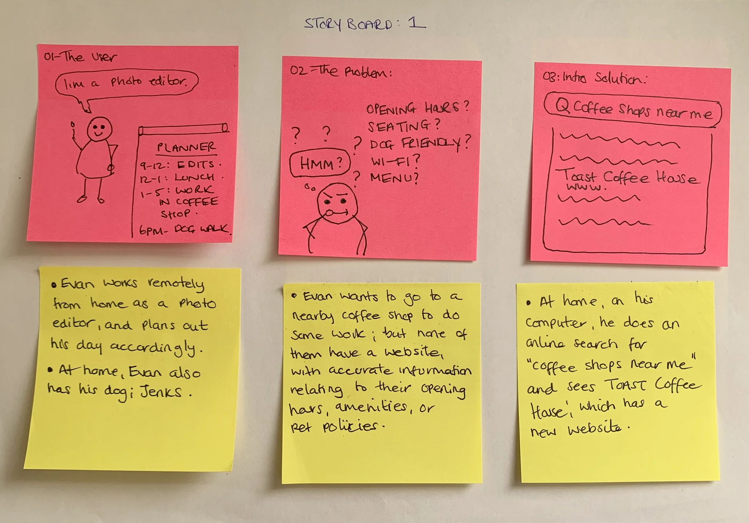
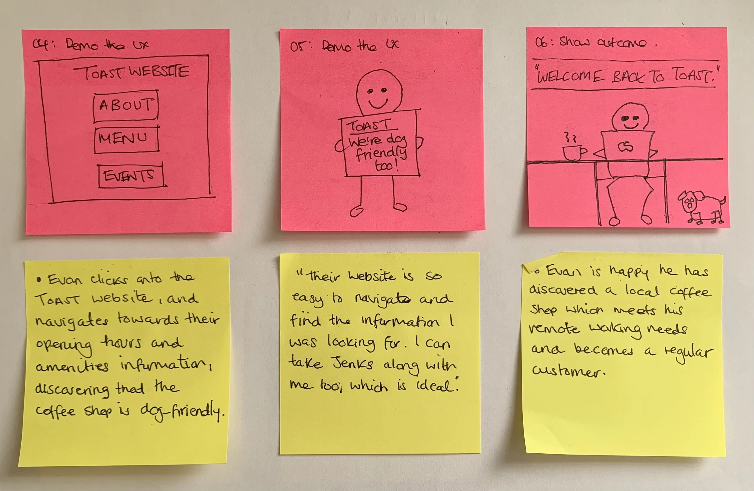
Storyboard 1: The remote worker
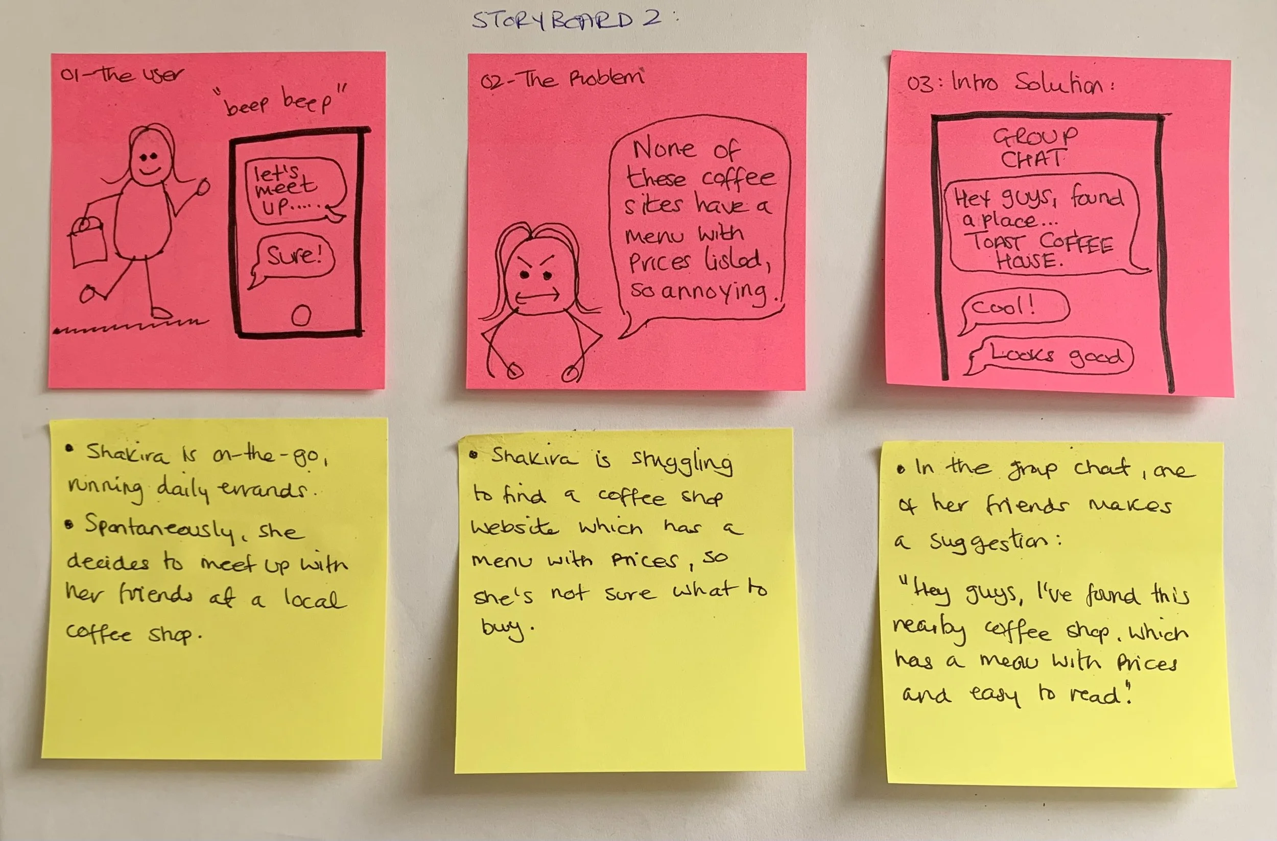
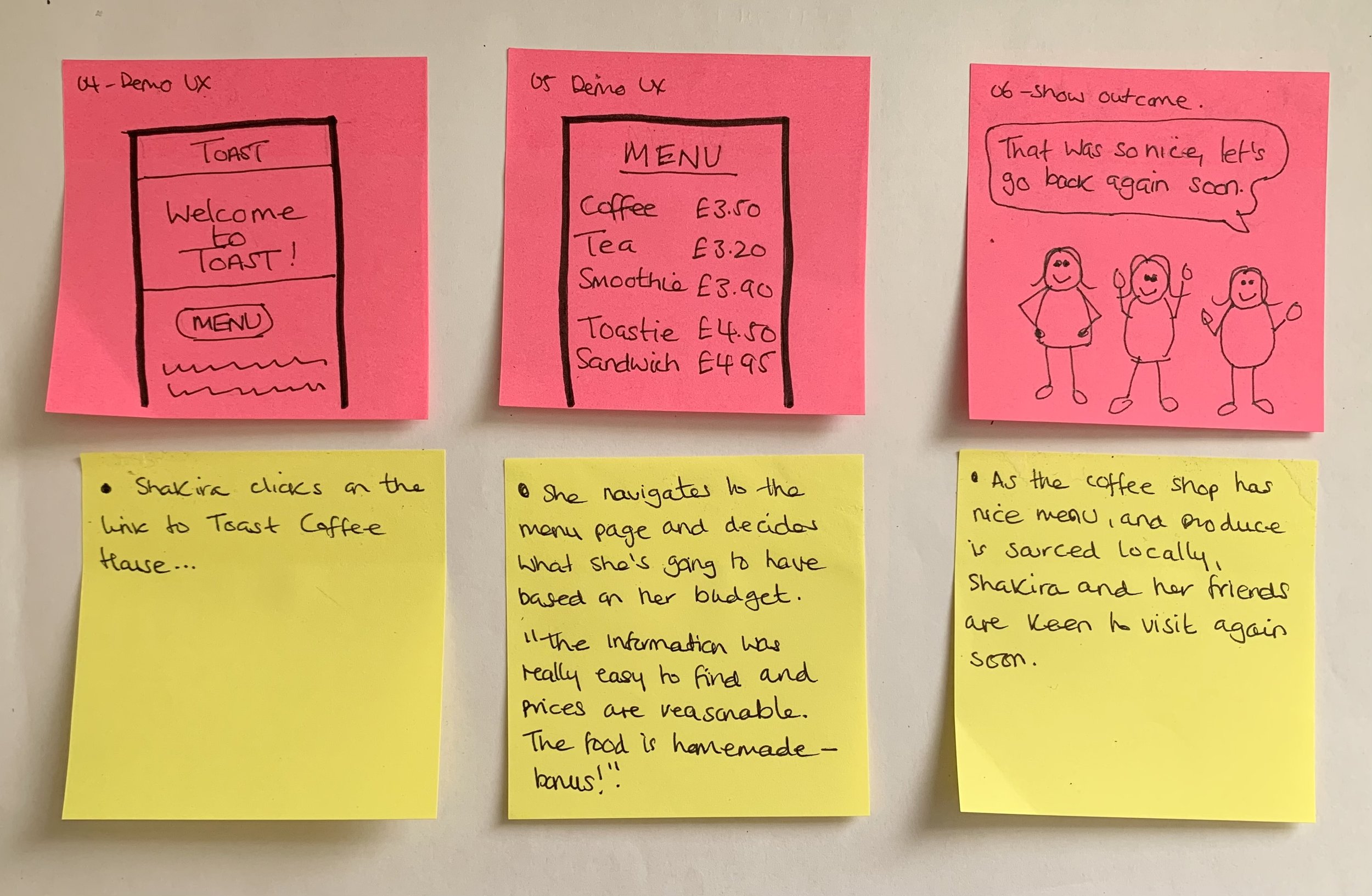
Storyboard 2: Meeting up with friends
Persona
Alongside storyboarding, I produced two personas, each representing a typical coffee shop customer.
Persona 1 = The ‘matcha latte mate’ - from the point of view of a person who uses coffee shops & cafes for socialising, meeting family and friends.
Persona 2 = The ‘cold brew connoisseur’ - from the point of view of a person who uses coffee shops & cafes as a location for working remotely.
Generating these two personas gave me the opportunity to empathise and understand the different scenarios in which users engage with a coffee shop website, and what their behaviours, needs and frustrations are.
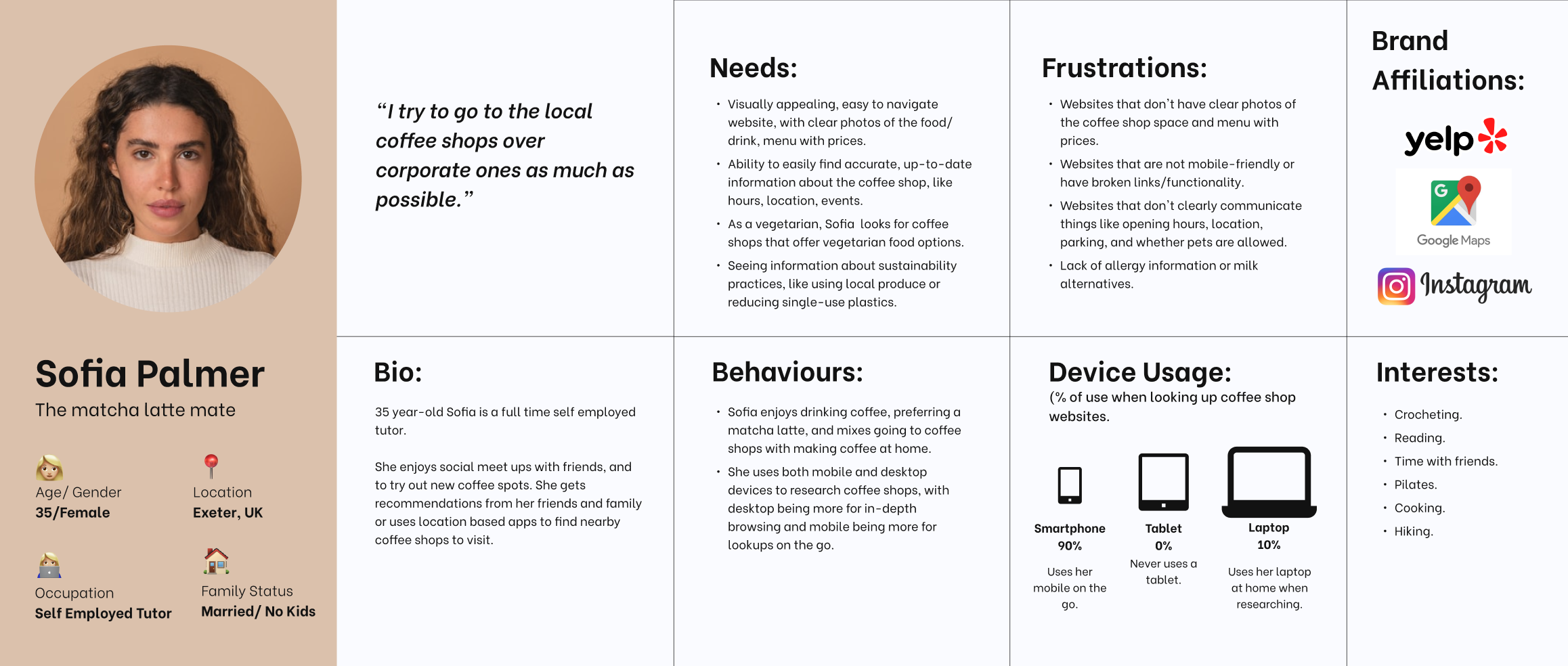
Persona 1: Sofia Palmer
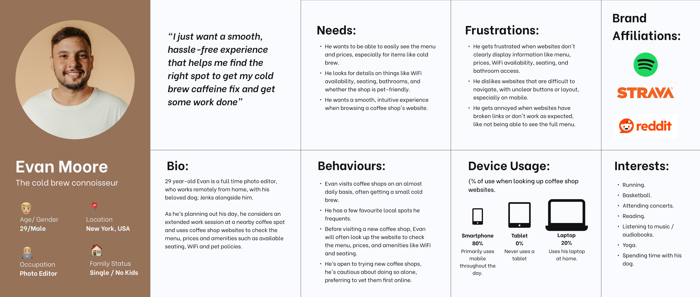
Persona 2: Evan Moore
Problem Statement
To pinpoint the key challenges users are encountering, a problem statement was written from the point of view of persona 1; Sofia, the matcha latte mate.
This part of the process helped to keep the team (of one) focused on solving the right problem as well as prioritise design solutions and features, which address the users needs.
Missing menu details & prices
POV
Looking to meet friends, self employed tutor Sofia needs a quick and reliable way to view an up-to-date coffee shop menu with prices because without that information, she can’t confidently choose a spot that fits everyone’s preferences, dietary needs, or budget - wasting time and potentially missing out on a good get-together.
How might we make it easy for Sofia to access reliable menu information, while on-the-go?
How might we reduce the time Sofia spends searching for a nearby coffee shop, to meet friends?
How might we enable Sofia to find a local coffee shop based on her friends' preferences, dietary needs and budget?
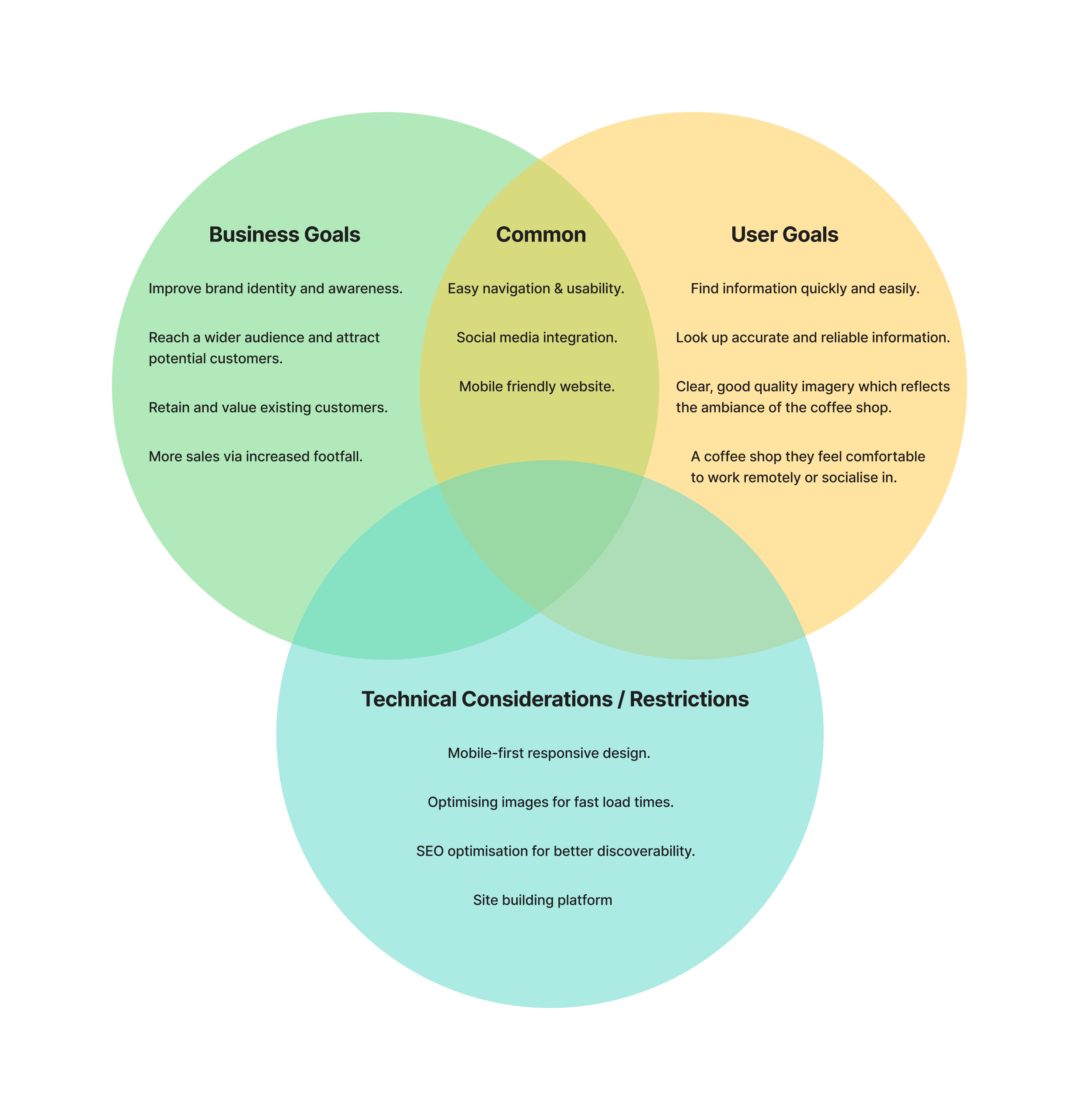
Project Goals
For an overview of the project goals, I made use of a Venn diagram to illustrate the business objectives and user needs, as well as any technical considerations or restrictions there may be moving forward.
Develop
Feature Set
The decision about what features were to be included on the website, were prioritised based on the research synthesis and personas, keeping in mind how each feature would support the users’ goals.
P1: Must Have
Homepage
Menu
Opening Hours
Location
Contact Form
About
P2: Nice To Have
Social media integration
Events
Reviews / Testimonials
Suppliers
Newsletter
P3: Surprising & Delightful
Loyalty Scheme
P4: Can come later
Online ordering for pick up
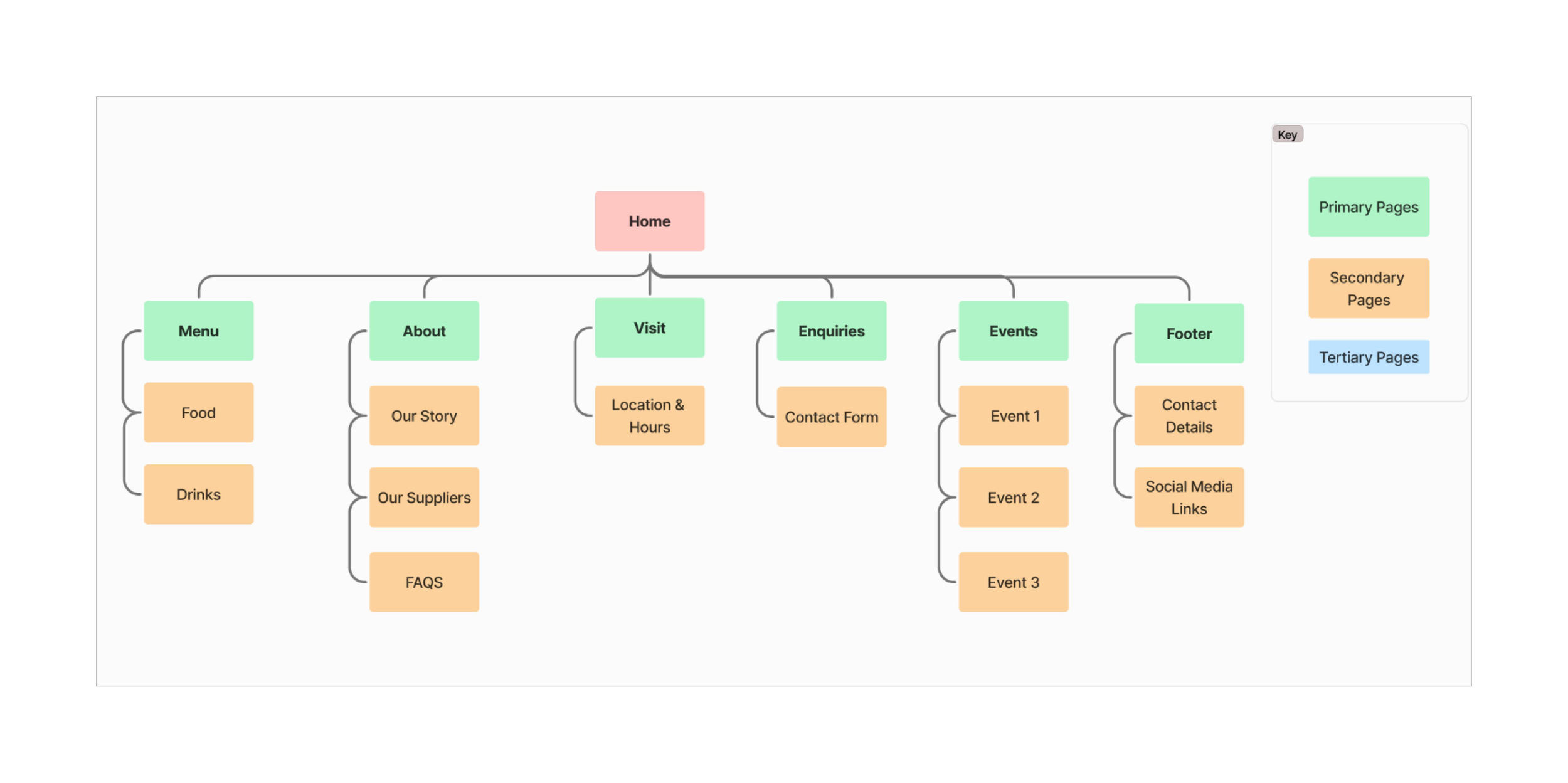
Sitemap
To visualise the site structure and content, I used Figjam to create a flat sitemap design with primary, secondary and tertiary pages. From the sitemap I could see how web pages and sections would be organised, as well as showing me how users might navigate through the website.
Task Flows
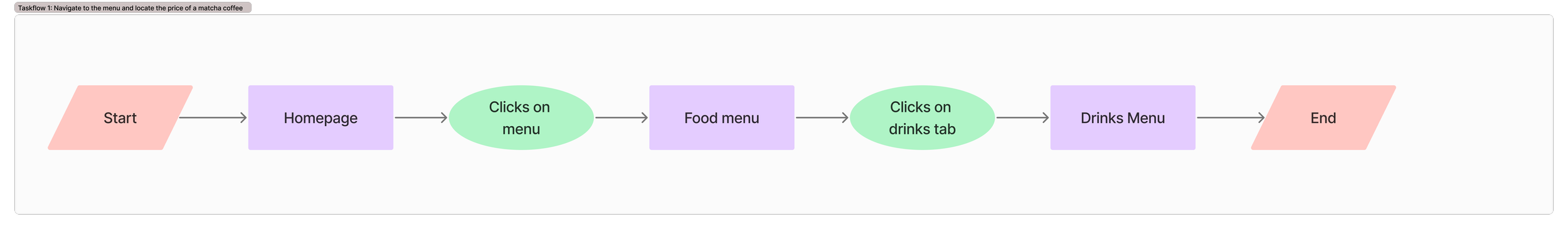
I created four task flows to highlight the path of actions that a user would need to take to achieve each of their goals. This type of flow helped me to identify the steps in a logical order.
Task 1: Navigate to the menu and locate the price of a matcha latte
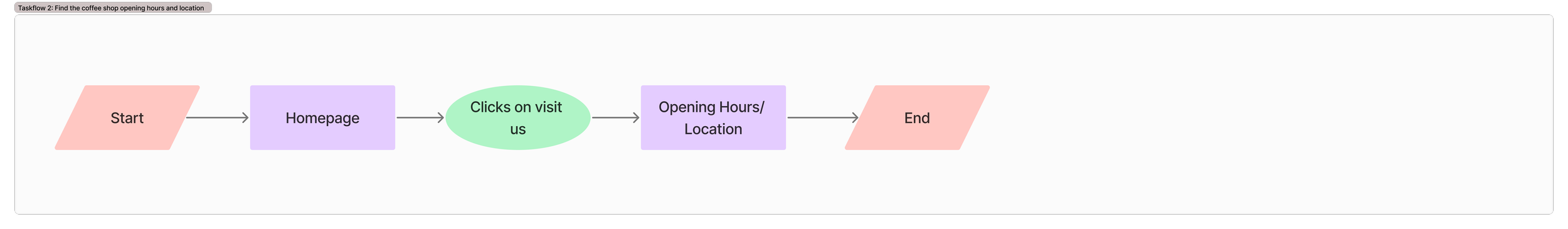
Task 2: Find the coffee shop opening hours and location
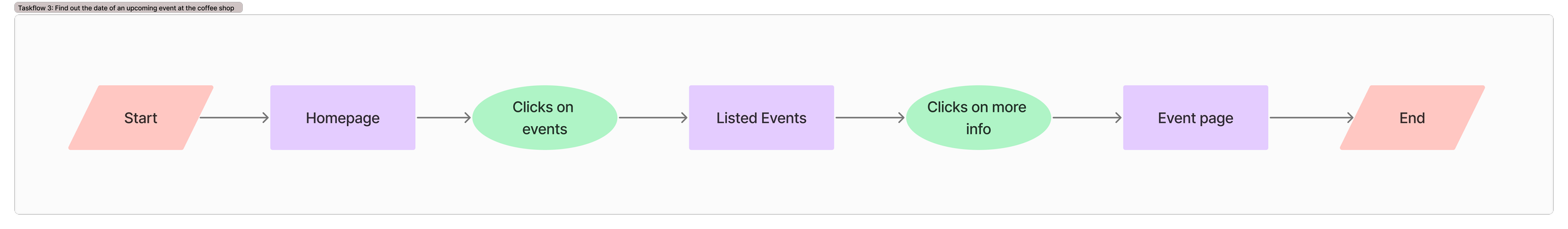
Task 3: Find out the date of an upcoming event at the coffee shop
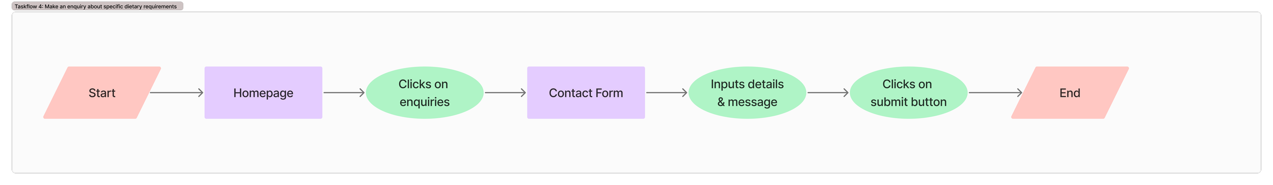
Task 4: Make an enquiry about specific dietary requirements
Lo-fi Wireframes
Having mapped out the information architecture, I sketched out my initial ideas using pen and paper, to identify the layout and content of the web pages. As the new website must be responsive, key screens would be produced in both mobile and desktop format.
Desktop Screens:
1 . Sketches of the Homepage.
2 .Sketches of Visit Us page.
3 . Sketches of Enquiries page.
Mobile Screens:
1 . Sketch of Homepage
2 . Sketch of Menu
3. Sketch of Visit Us
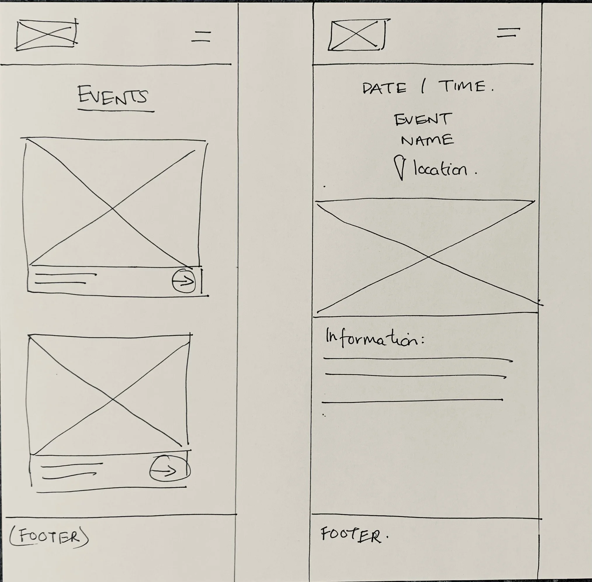
4 & 5 . Events Listed & Event Details
Deliver
Branding
As the business had already established their core brand identity via their social media channels, I utilised some of their current assets to build a brand style tile; including components such colour palette, typography and imagery, which would be used throughout their new website. If I’d had more time on this project, I would have liked to have included more original imagery, photographed by myself.
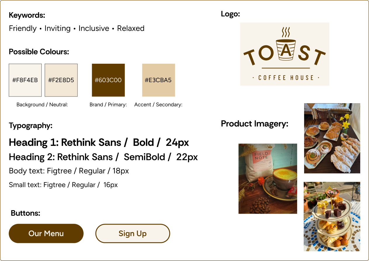
Toast Style Tile
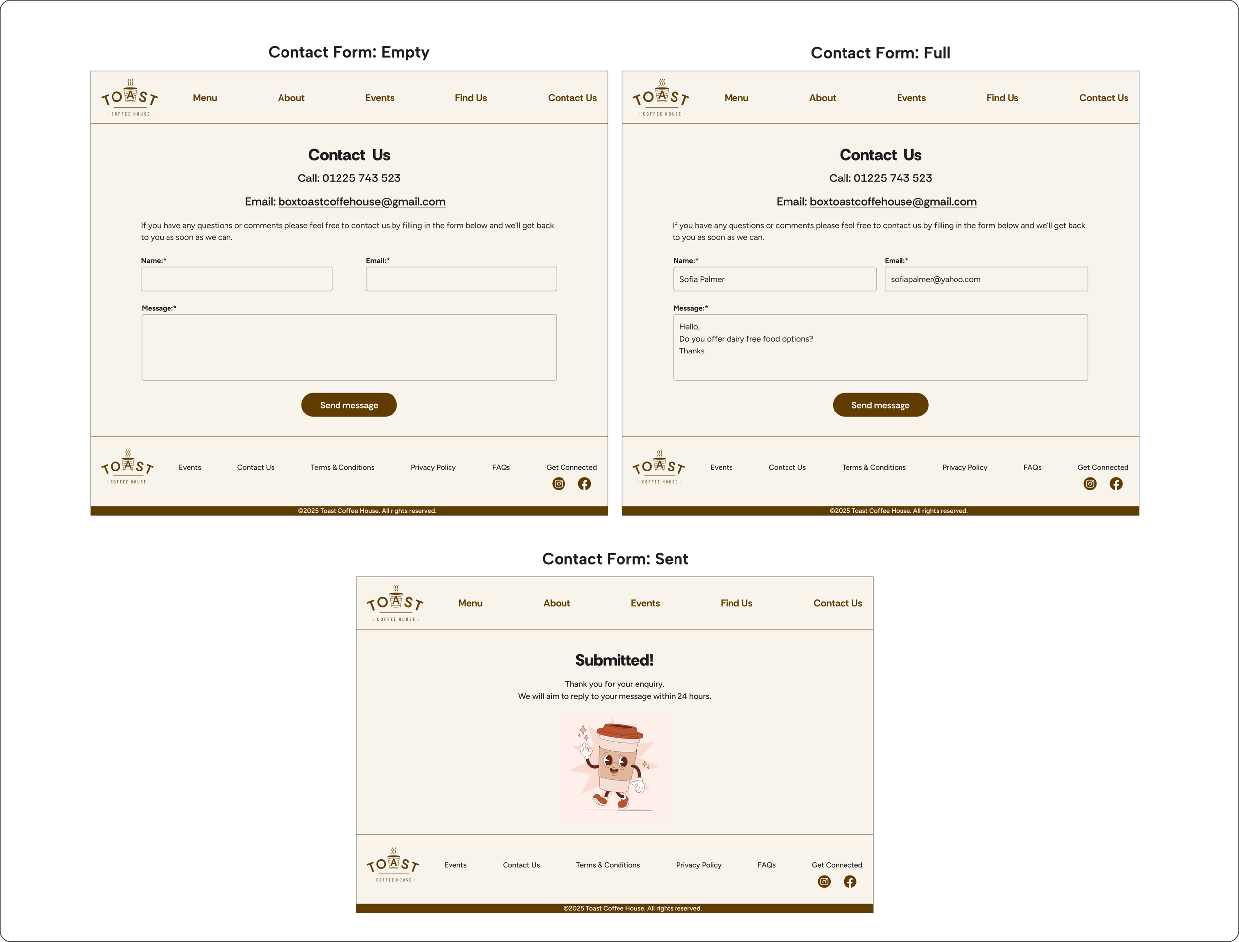
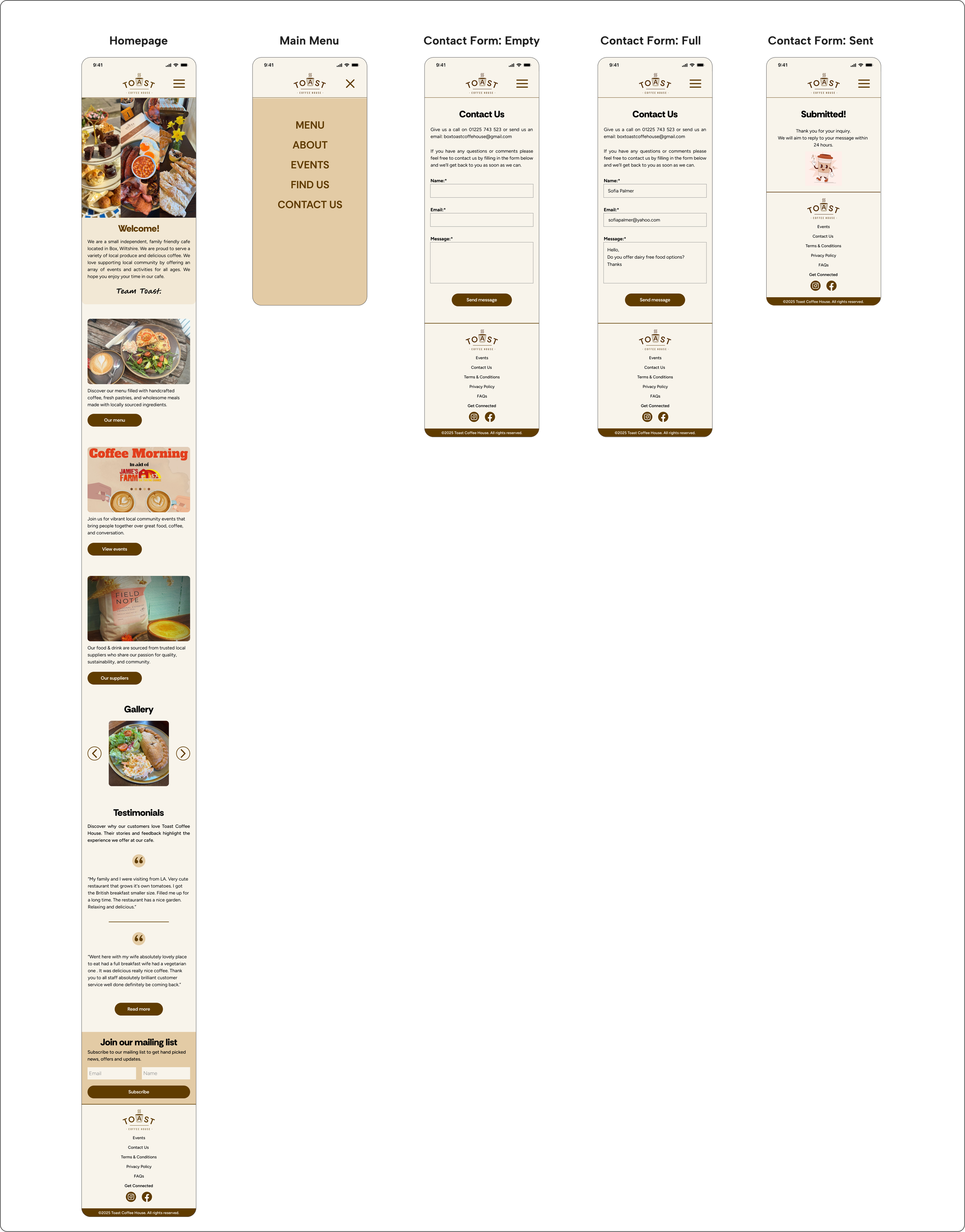
Hi-fi Wireframes
Using the results and comments from the first round of usability testing, I began creating hi-fi wireframes for each task flow, in both mobile and desktop format. I applied the business’s brand identity and style choices, to ensure a consistent look and feel. The hi-fi screens served as a realistic preview of the website, which I could gather further feedback and validation.
Desktop Screens:
Mobile Screens:
Usability Testing & Revisions
I created a functional high-fidelity prototype which I took to usability tests to validate the design and identify any areas for improvement. I conducted seven moderated usability tests remotely via Zoom, sharing the Figma prototype in mobile and desktop format.
Each participant was asked to complete four tasks:
Navigate to the menu and find the price of a matcha latte. (mobile only).
Find the coffee shop opening hours and location (mobile & desktop).
Find the date of an upcoming event at the coffee shop (mobile only)
Make an inquiry about a specific dietary requirement (mobile & desktop).
Summary of key findings:
The test results showed that users found the website navigation intuitive and straightforward. The overall impression of the website was cosy, warm and welcoming.
7/7 users were able to complete 4/4 tasks under 60 seconds.
7/7 users rated 4/4 tasks as easy or very easy to complete.
7/7 users were able to complete 4/4 tasks without assistance from the moderator.
4/7 users were able to complete 4/4 tasks without any mis-clicks or errors.
Observations:
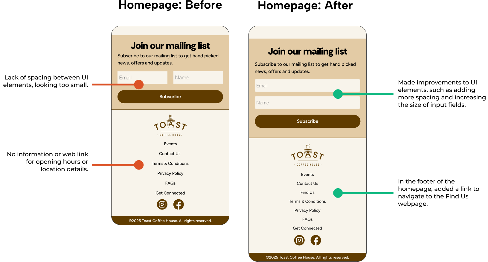
During task 2 (please show me how you would find the cafe's opening hours and location) I observed that all participants scrolled to the homepage footer, expecting the opening hours and location information to be there, or on the homepage in general.
Recommendations for improvement included:
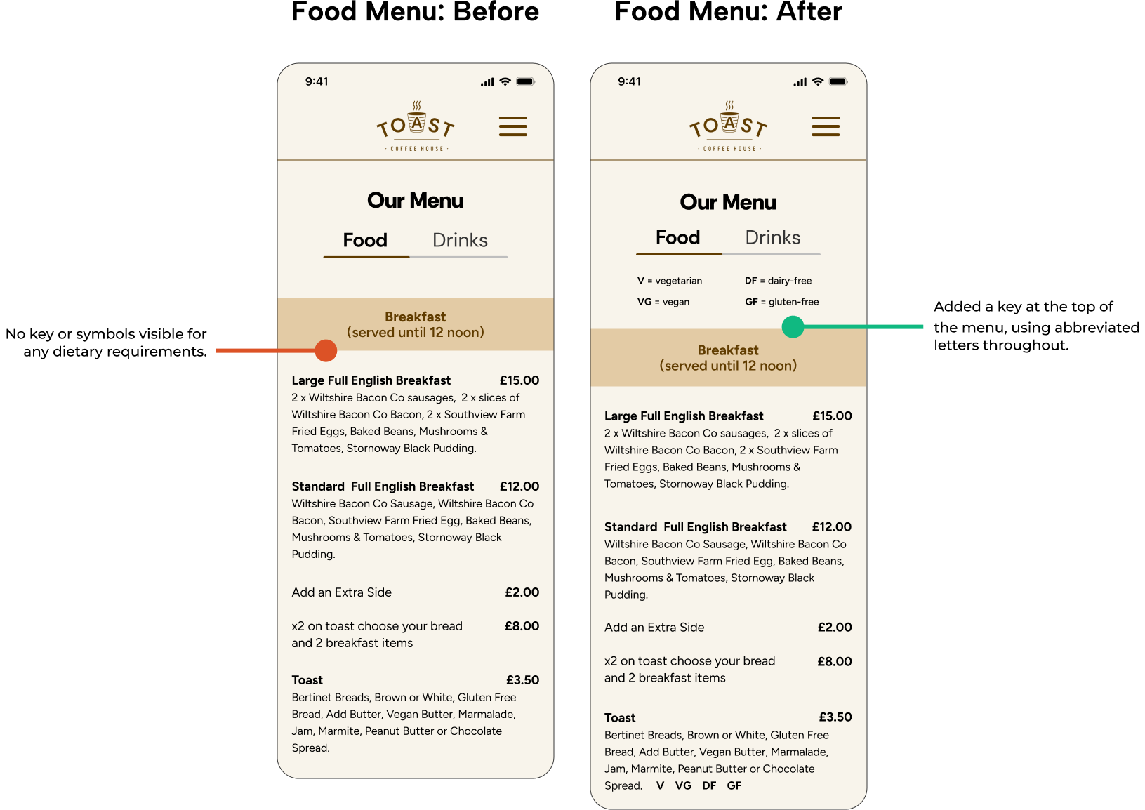
Task 1: Add dietary information and/or legend to the menu.
Task 2: Add location or opening hours information to the homepage.
Improve some UI elements such as spacing and layout.
Task 1 - Design Decisions:
Added a dietary requirements key & symbols. As users expected to see this information visible on a menu.
Task 2 - Design Decisions:
Based on overall feedback from participants, I improved the layout and spacing of UI elements.
Based on observations from the moderated usability test, I added a link in the footer to navigate to the find us webpage.
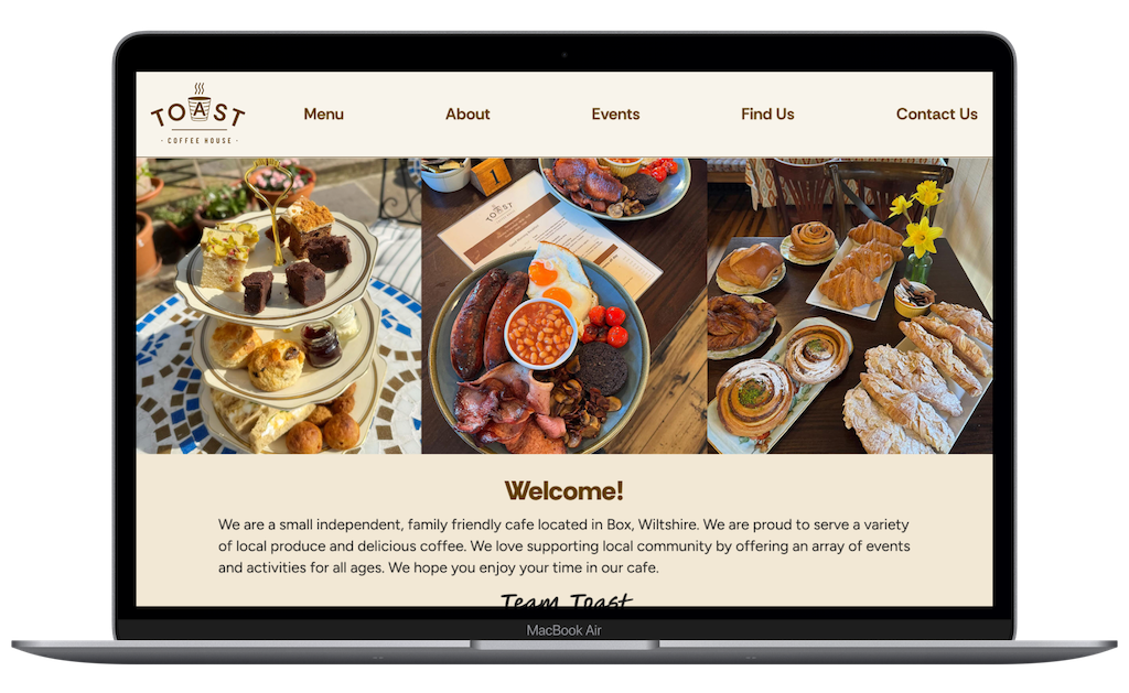
Final Product
Reflection
What was your main challenge in the project, and how have you handled it?
I had to make few trade-offs, due to time constraints. I didn’t actually liaise with the business and instead I utilised my mentor as a stakeholder.
I didn’t gather all the image assets I wanted to add to the website, such as the interior or exterior of the cafe. I was planning to take some photographs of my own. As this ended up being a low priority revision, I decided I could come back to it at a later date.
As I created a flat sitemap design, I didn't think I needed to carry out a card sort to organise the information architecture of the site, however on reflection it would have been beneficial to carry one out to avoid any user confusion during my usability tests. I had mixed feedback from participants about where certain pieces of information should live on the website.
What are some lessons you’ve learnt through the project?
Learnt more about balancing business needs alongside user goals. I think that I approached this project with a better perspective on what the requirements might be for a small, locally run business.
Information architecture is important and carrying out a card sort will be beneficial to help to avoid user confusion.
It can be relatively easy to become somewhat detached from user; keep the persona at hand throughout the process to inform design decisions.
Has the project changed your outlook as a designer?
Yes, this project has changed my outlook. There are quite a lot of small, local businesses that could benefit from having a user-friendly, responsive website, and so this may provide me career opportunities as a freelance UX Designer.
What are your next steps for the project?
My intention would be to take the project work I’ve completed so far and present it to the business owners to gather their thoughts and feedback. Time permitting, I would also build on the website features which were outlined earlier on; such as suppliers information, a loyalty scheme and click & collect service.