

spriggle
A dedicated mobile app for gardeners to locally exchange plants and seeds.
OVERVIEW
‘spriggle’ is a dedicated gardening platform. The app can be used to exchange plants and seeds, as well as engage with the gardening community through events and discussions.
This concept was created as a student project for Designlab UX Academy. I was responsible for the end-to-end design process; user research and analysis, information architecture, wireframing, visual design, and usability testing.
ROLE
UX/UI Designer, UX Researcher
TOOLS
Figma, Figjam, Zoom, Google Docs, Fathom AI Notetaker, ChatGPT.
TIMELINE
July - October 2025
GOAL
The main goal of this project was to create an app concept constrained to its minimum viable product (MVP).
Problem Hypothesis
Despite the rise in gardening as a hobby and sustainable lifestyle choice, gardeners lack a dedicated platform where they can easily sell, purchase, or give away seeds and plants.
Currently, exchanges often take place through fragmented platforms like social media groups, bulletin boards, or generic websites, which do not cater to the unique needs of plant and seed trading - such as sharing detailed growing instructions, ensuring plant health, seasonality and matching varieties to local climate conditions. This results in wasted surplus seeds and plants as well as missed opportunities for gardeners to connect, trade and share knowledge.
Possible Solution
Through design thinking, I developed a plant and seed swapping app which is aimed to create a vibrant community amongst gardeners, on and offline, within a local area.
Discover
To validate the problem hypothesis and to understand what similar products already have to offer, I carried out a competitive analysis and one-to-one user interviews.
Competitive Analysis
I compared the current product offerings of (one) indirect and (three) direct market competitors. Utilising this research method allowed me to identify target audiences, any similar capabilities or features as well as opportunities to differentiate my concept.


Key learnings from competitive analysis:
Local discovery is important. Users like meeting nearby plant people.
Peer-to-peer marketplace works, but can be limiting as it doesn’t stand out.
Extra features = opportunity to add value & keep users.
User Interviews
Examples of interview questions I asked:
What kinds of things do you grow (e.g. flowers, vegetables, herbs, houseplants)?
What keeps you gardening - what do you enjoy most?
What are some common challenges or frustrations you’ve experienced with gardening?
How do you usually get new plants or seeds? (e.g. buy, swap, save, gift)
Have you encountered any challenges or difficulties when sourcing plants or seeds? If so, what are they?
Do you ever find that you end up with any surplus plants or seeds? If so, what do you do with them?
What would make you feel more confident in trading plants/seeds with other gardeners?
How important is local / community connection to your gardening experience?
With ideas of how I could differentiate and add value to my concept, I proceeded to interview potential users, one-to-one.
The research goal: to explore and understand gardeners’ overall experiences, including motivations, needs and challenges in their gardening journey - including how they might trade, share, or source seeds and plants.
Participants included: new or experienced gardeners, indoor & outdoor gardeners, urban & rural gardeners, plant or gardening app users.
6 interviews
Age range: 21 - 45
Remote via Zoom + Fathom AI Notetaker
Define
Affinity Mapping
Once all the interviews had been completed, I synthesised the data using Figjam to create an affinity map. I was able to establish key patterns and themes by visually organising my interview findings into groups.
Key Themes Identified:
Challenges
Pests and finding solutions. Plant care maintenance, especially specific to the region.
Plant/seed sourcing = Mainly from independent stores, nurseries or garden centres.
Plant Sharing
Give away surplus plants / seeds to family and friends, usually in-person.
Information Sourcing
Other plant parents, neighbours, family, friends, online search, social media.
Community
Strong emphasis on community connection, either online or locally, for advice and shared experiences.
Platform Preferences
Local events, activities, meet-ups or resources.
Community discussion and advice.
Plant / seed care or growing guides.
User verification, profile badges, ratings, or reviews..
Persona
With the findings from the interviews, I produced a persona representing a typical user of the mobile app.
Generating a persona provided me the opportunity to understand and empathise with the target audience, as well as guide my design decisions based on user needs, motivations and frustrations. Meet Claire, ‘The Nurturing Gardener’.
Problem Statement
To highlight what problem needed to be solved for the persona, I used the insights gained from user research to write the problem statement consisting of insights, user needs and HMW questions.
Insight
Users are frustrated by the lack of gardening platforms that don’t combine both online and local community experiences.
Needs
Opportunities for local engagement, such as plant swaps, meet-ups, or events.
Problem Statement
Claire, a socially engaged gardener, needs a trustworthy platform that blends online convenience with local community interaction, because she’s frustrated by fragmented tools that don’t offer both reliable information and real-world connection in one place.
HMW
How might we help users like Claire discover and engage with nearby plant enthusiasts and resources through one platform?
Develop
User Flow
Using Figjam, I created a user flow to demonstrate the different paths a user may take whilst using the application. This gave me to opportunity to consider what the happy path and unhappy path would look like.
Flow diagram showing the micro interactions the user would be take to complete their goal.
Task Flows
I generated 3 task flows to realise the sequence of steps the user would need to take in order to reach each of their goals.
Task 1: Sign up to the app as new user
Task 2: Finding a spider plant and ask other user if they’d like to swap
Task 3: Find a plant/seed swapping event you’d like to attend
Lo-fi Wireframes
With both the user and business goals in mind and having defined a feature roadmap, I began to sketch out my initial ideas using pen and paper; to identify the core functionalities of the app as well as the content and layout of key screens. Hand sketching allowed for rapid visualisation and exploration of ideas in a short amount of time.
Sketches: task 3 - Find a plant/seed swapping event you’d like to attend
Mid-fi Wireframes
I brought my hand sketches into Figma and began designing the key screens for each of the task flows. Increasing the detail of the wireframes meant that I could better define the content hierarchy, the layout, functionality and information architecture.
Mid-fi wireframes, created in Figma
Deliver
Mid-fi Usability Testing
To measure the effectiveness and usability of the mid-fi wireframes, I completed 6 moderated usability tests via Zoom, asking participants to share the Figma prototype screen whilst carrying out the test. With verbal consent from the participants, I was able to record each session utilising Fathom AI notetaker, which as the moderator, allowed me focus on the test.
To gauge success, the metrics I used included; time on task, single ease question, error rate and user feedback.
Task flows being tested:
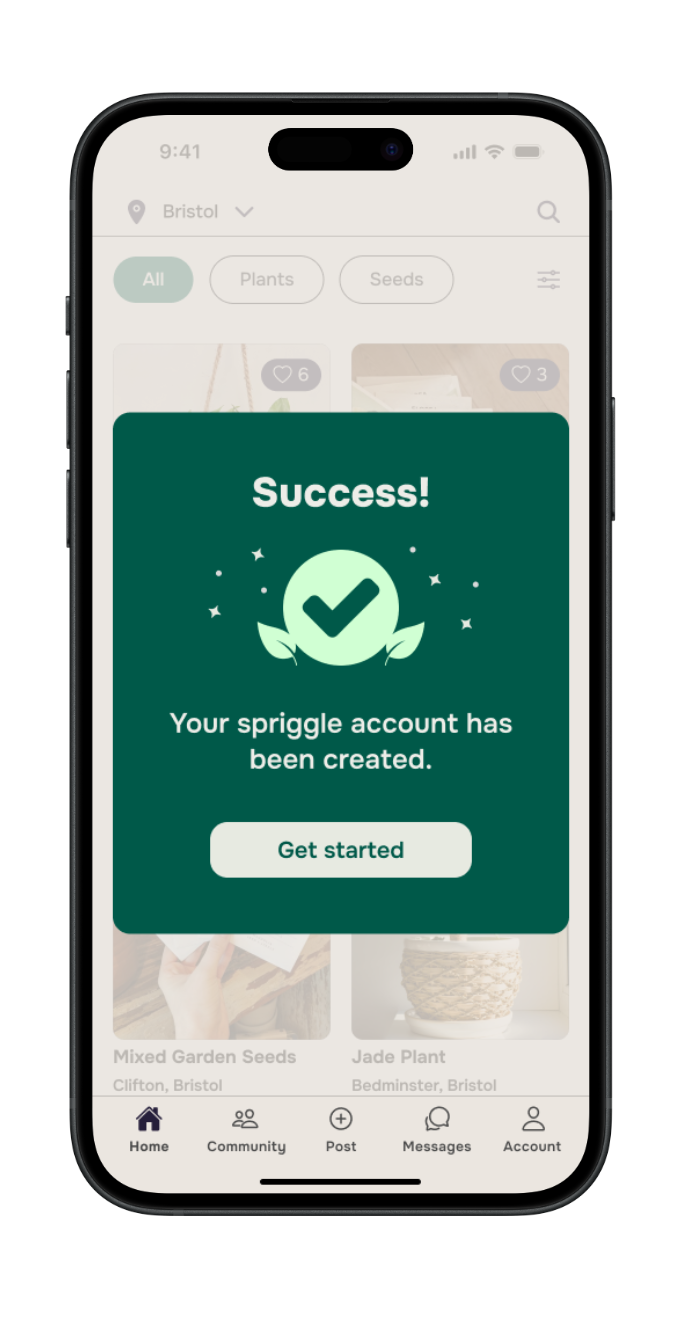
Sign up to the app as a new user.
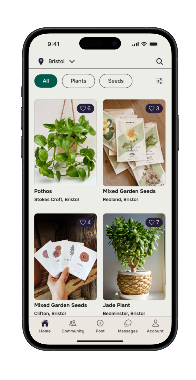
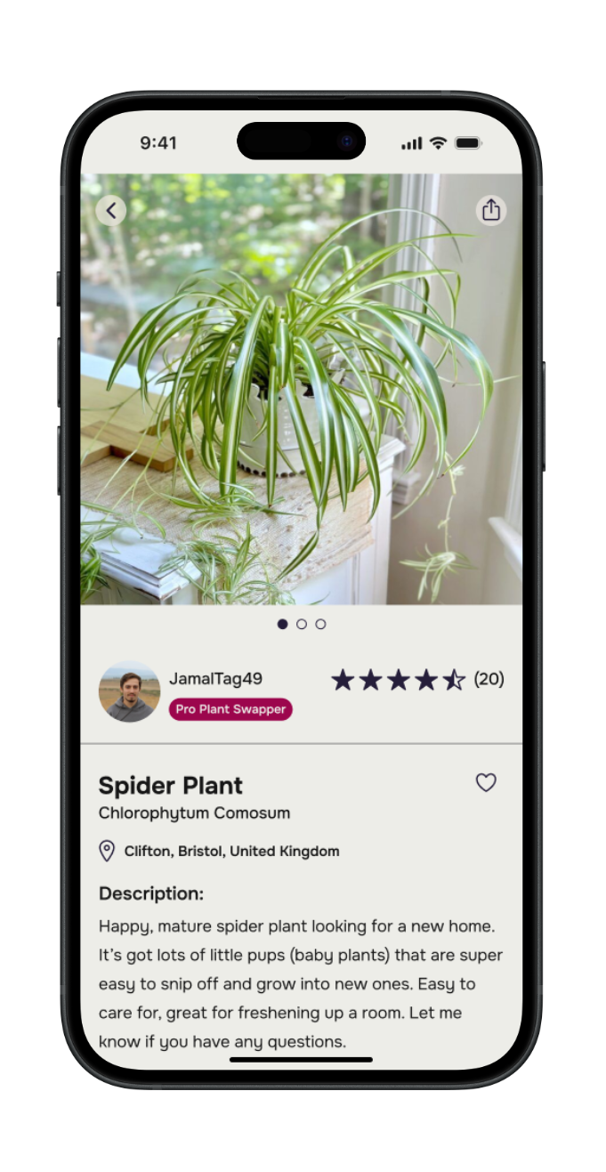
Find a (specific) plant and asking the other user if they’d like to swap.
Find a plant / seed swapping event you’d like to attend.
Visual Design
Whilst carrying out mid-fi usability testing I began thinking about the visual design, including UI and branding. For inspiration, I looked at other web pages, books, shop fronts, apps, to gather references for a moodboard, which began to define the direction of the brand and its core values:
Community · friendly · sustainable · connection
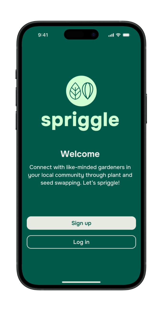
I developed the brand values based upon the research and user persona. After brainstorming ideas for a brand name, and with feedback from my peers, I settled on ‘spriggle’.
The thinking behind the name:
“Sprig” = a small shoot, twig, or cutting - what gardeners might share and swap. It’s tied to the act of plant propagation and exchange.
“–gle” ending gives it a playful, modern sound. It makes the name feel lighthearted and approachable.
Friendly & playful: The sound invites warmth and fun, reflecting community and friendliness.
Catchy & brand-able: Unique enough to stand out, short enough to be memorable.
Initial ideas; hand sketches
Development; Figma Design
Hi-fi Wireframes
Once the visual design elements had been established, I applied the core band identity and style choices to create hi-fi wireframes for each task flow. The hi-fi screens served as a realistic preview of the MVP, which I could gather further feedback and validation from in the next round of usability testing.
Usability Testing & Revisions
I created a functional high-fidelity prototype which I took to usability tests to validate the design and identify any areas for improvement. I conducted 7 moderated usability tests remotely via Zoom, sharing the Figma prototype.
Utilising the same success metrics, each participant was asked to complete three tasks:
Signing up to the spriggle app as a new user.
Find a spider plant and ask the other user if it’s available to swap.
Find a plant swapping event they’d like to attend.
with follow up questions around the overall look and feel of the product. The test results indicated that the app met with user expectations and was easy to navigate.
Participants clearly identified how the app could contribute towards more sustainable and affordable gardening practices as well as building local gardening communities.
Recommendations for improvement included:
Task 1: Change the content in the message modal to be more enthusiastic and inviting.
Task 2: Revise the AI icon design for better recognition and visibility.
Sign up to the spriggle app as a new user
Revised the content of the message model at the end of the sign up process.
Find a spider plant and ask the other user if it’s available to swap
Revised the icon to be more recognisable and visible on the listing page.
UI Kit
To ensure a consistent look and feel, as well as increase the productivity for other designers or developers, I created an app UI kit containing reusable components and elements
Final Product
Reflection
What was your main challenge in the project, and how have you handled it?
I found one of the main challenges to be the branding. This element of the project took me out of my comfort zone, being relatively new to the task of establishing a brand identity from its very beginning. I had to produce all the assets, including, logo, colour palette, typography, icons. For me, this stage of the process felt one of the most iterative, by seeking critique and making changes which also fell in accordance with accessibility guidelines.
What are some lessons you’ve learnt through the project?
During the end-to-end design process, I wanted to start learning how I could speed up my workflow, especially during the user research phase. This project gave me the opportunity to use tools such as; Fathom AI Notetaker, ChatGPT, to help summarise my findings and create actionable insights. Working as the sole UX designer, I have started to learn how I can utilise AI tools during the early phase of a design project to assist with scope and direction.
As the sole UX Designer and Researcher on this project, I had to be resourceful, especially during the research phase when it came to recruiting participants for the user interviews.
Feedback and collaboration are fundamental towards creating a user-friendly product. At each stage of the project, I sought feedback from potential users, my mentor, my design peers, as well family and friends.
Has the project changed your outlook as a designer?
Yes, my outlook is more optimistic having seen this project through its entirety, from start to finish - which I am proud of! I can approach any aspect of the design process with more confidence in my abilities; whether it’s user research, information architecture, or wireframing, my skills as a UX Designer will be sure to add value to products for both users and businesses.
What are your next steps for the project?
Based on feedback from participants during the last round of usability tests, I would be keen to develop and test more features of this application, including user profiles, a ticketed event system, discussion threads, extra resources such as; stand-alone plant care guides, pest / disease identification.