
Spotify
Adding a feature to their existing podcast service.
OVERVIEW
Completed as part of Designlab’s UX Academy, this project was led end-to-end by me as the sole UX Designer and Researcher.
ROLE
UX/UI Designer, UX Researcher
TOOLS
Figma Design, Figjam, Zoom, Google Docs, Miro
TIMELINE
January - April 2025
GOAL
The main goal of this project was to add a feature to Spotify’s existing mobile app.
Background
Spotify is an audio streaming and media services provider founded in 2006 by Daniel Ek and Martin Lorentzon in Stockholm, Sweden. Since 2015 Spotify has become one of the major podcasting providers with over 4 million podcasts available as well having over 100 million regular podcast listeners.
Target Audience
People who regularly listen to and/or follow podcasts.
People who use Spotify.
Problem Hypothesis
As Spotify continues to offer a vast number of podcasts which users can follow, there are currently limited ways in which users can organise their podcasts.
“I hate how cluttered my library gets with all of the podcasts I listen to just not in folders. I think it would be much more neat if I could just have a podcast folder as all of my playlists are in folders and organised so makes sense.” - Spotify Community member
“I use Spotify every day, and I love listening to podcasts. But sometimes, I can’t find the podcast channels I follow because this part is so confusing and not tidy. I want to use folders and add my podcast channels there, so I can categorise them by type.” - Spotify Community member
Possible Solution
A new feature which allows users to customise their podcast library, more to their own preferences.
Discover
I carried out a competitive analysis of other podcast platforms, to gain an insight into what features they offer to listeners, as well as conducting one-to-one user interviews to validate the problem hypothesis.
Competitive Analysis
I compared the features of (three) direct market competitors; Apple Podcasts, YouTube Music, Pocket Casts and (one) indirect competitor; Libby. Utilising this research method allowed me to identify any similar capabilities or notable differences as well as opportunities to differentiate with a new feature.

Libby
Pocket Casts
Youtube Music
Apple Podcasts
Key Learnings:
What the strengths and weaknesses of Spotify are within the podcast market.
Understanding what features other podcast platforms have to offer.
How Spotify’s podcast experience could potentially be improved, to help its competitiveness.
Spotify excels as music platform, however its podcast platform comes across as somewhat of a second thought, and has room for improvement.
Similar Capabilities:
Allow the user to easily find and follow podcasts shows.
Download and listen / read offline.
Create episode playlists.
Navigation bar with Home, Search, Discover/Browse, Library, Profile.
Apparent Differences:
Some of the companies - Pocket Casts and Youtube Music, put a higher significance on a user profile with listening stats, whilst others - Spotify, Apple Podcasts, Libby do not.
The companies which solely focus on podcasts seem to allow users to customise their experience more, especially in terms of organisation.
Only Spotify and YouTube Music currently offer both audio and visual podcasts.
Opportunities:
Giving the user more customisation over their podcast discovery and/or organisation.
Provide more regular podcast insights to the user.
Creating an engaging and podcast specific profile.
User Interviews
7 interviews
Age range: 21 - 40
Remote via Zoom
I wanted to continue to validate the problem space and to hear from regular podcast listeners about their experiences of using Spotify and any alternative podcast platforms.
The research goal: To understand how people currently use Spotify to listen to podcasts and what methods they use to find and organise their content.
Participant criteria: People who use Spotify, people who use alternative podcast platforms, people who regularly listen to and/or follow podcasts.
Research Questions:
Discovery:
Why do people choose Spotify over alternative platforms?
How do people discover podcasts?
How do they decide what particular podcasts to follow, if at all?
Organisation:
Do people have a podcast library and why, or why not?
How do people prefer to organise their podcast library, if at all?
Do people feel at all limited by the current ways in which they can sort their podcast library and how would they improve it?
Are people dissatisfied with any other elements of their Spotify podcast experience and why
Define
Affinity Mapping
Once all the interviews had been completed, I synthesised the data using Miro to create an affinity map. Using sticky notes, I was able to establish key patterns by visually organising my interview findings into groups.
Key Findings:
Listening Habits
Users choose Spotify for podcasts because they are already subscribed to the platform for music.
Mood heavily influences what podcast users want to listen to.
Users listen to podcasts in the background whilst doing daily activities.
Users follow a high number of podcasts but don't listen to them all, and stick to listening to the same ones
Podcast Stats / Insights
Users don't take notice of their Spotify profile, it has very little significance and they rarely navigate towards it.
Users aren't particularly interested in getting any stats, as podcast listening is for enjoyment, not goal orientated.
Podcast Discovery
Users don't spend much time or effort actively searching for new podcasts.
Get their recommendations via word or mouth, from friends - then do a search.
Podcast Library Organisation
Users have forgotten about podcasts in their library, or not even aware of the library feature.
Users didn't know they could organise their podcast library.
For users who follow a large number of podcasts: if they could organise their library more, they'd want to create their own groupings.
Would Like..
Better, more personalised podcast recommendations and /or suggestions.
To be more in touch with their podcast library.
An easy and quick way of organising their library to their own liking.
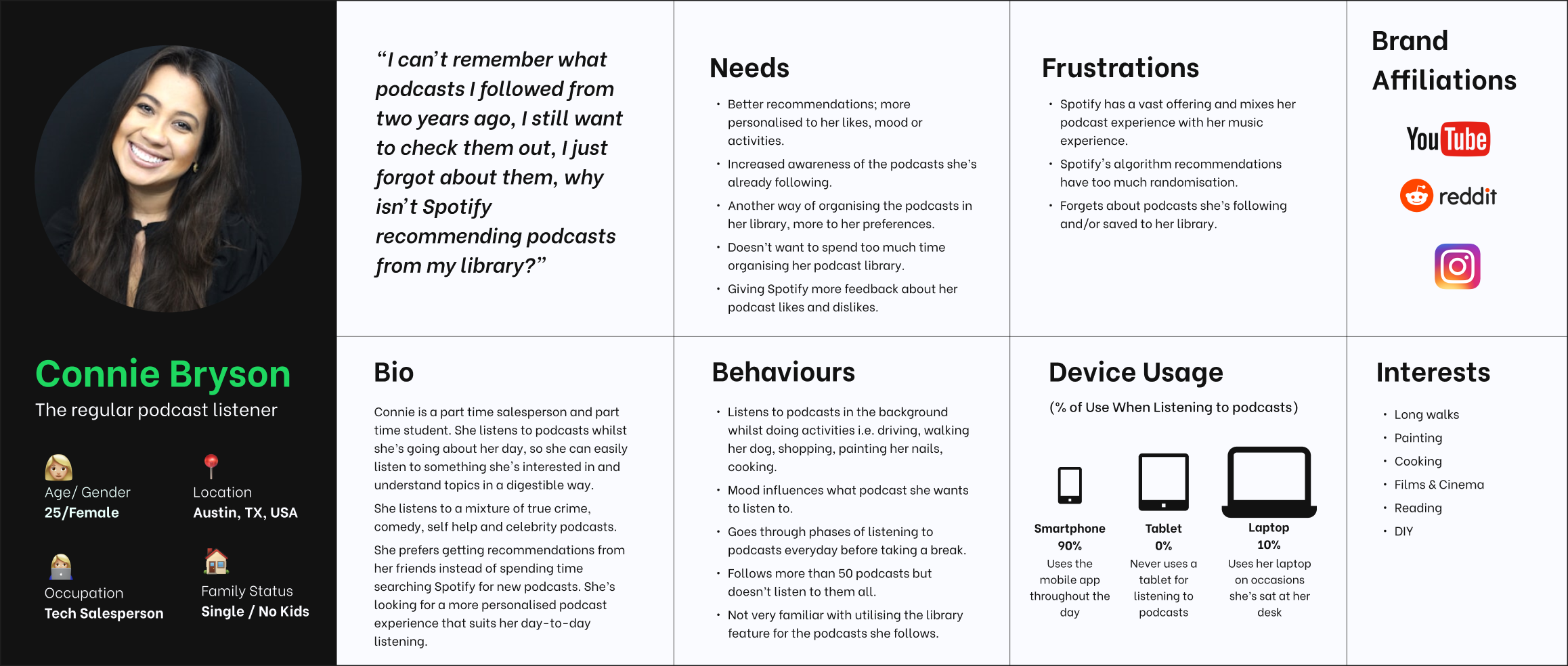
Persona
With the findings from the interviews, I produced a persona representing a regular podcast listener.
Generating a persona provided me with an understanding of the target audience, their behaviours, needs, and frustrations. This deliverable also anchored my design decisions moving forward.
Problem Statements
To highlight what problem(s) needed to be solved for the persona, I used the insights gained from user research to write two problem statements, including insights and How Might We questions.
Insight (1)
Users don’t go to their podcast library and have forgotten about podcasts they’re following.
Problem Statement (1)
Users aren’t actively engaging with their podcast library and often forget about the podcasts they’re following. This results in missed episodes, decreased listening habits, reduced retention.
HMW (1)
Create a more engaging experience that reminds users of their followed podcasts and encourages more regular listening?
Insight (2)
Users unaware of the ability to sort their podcast library.
Problem Statement (2)
Users are unaware that they can sort their podcast library, leading to difficulty in accessing their followed podcast shows efficiently. This lack of awareness may result in reduced engagement and missed episodes.
HMW (2)
Improve the sorting functionality to help users better manage their podcast library?
Develop
Feature Set
The decision about what feature to add were prioritised based on the research synthesis persona, and problem statements. Creating this roadmap gave me the opportunity to explore potential sub-features, which could form as part of a larger main feature.
P1: Must Have
Dashboard Highlight: Make the users podcast library more visible on the home dashboard screen.
Still Interested Reminders: Notify user about the podcasts they follow in their library, but haven't listened to in a while.
Podcast Groupings: User can create podcast groupings to their liking, within their library.
P2: Nice To Have
Time Capsule: Highlights podcasts that the user was listening to 'x' time ago.
P3: Surprising & Delightful
Quiz: Ask the user ‘quiz’ style questions about podcasts they follow and their listening habits, to unearth better recommendations.
User Flow
Using Figjam, I created a user flow to demonstrate the different paths a user may take whilst using the feature idea, on the mobile app. This also gave me the opportunity to understand how the new feature would fit in with Spotify’s existing information architecture.
Task Flows
Having outlined the feature set and user flow, I proceeded to generate four task flows to realise the sequence of steps the user would need to take in order to reach each of their goals.
Task 1: Still interested in these podcasts?' Reminder.
Task 2: Dashboard - Podcast Library Highlight.
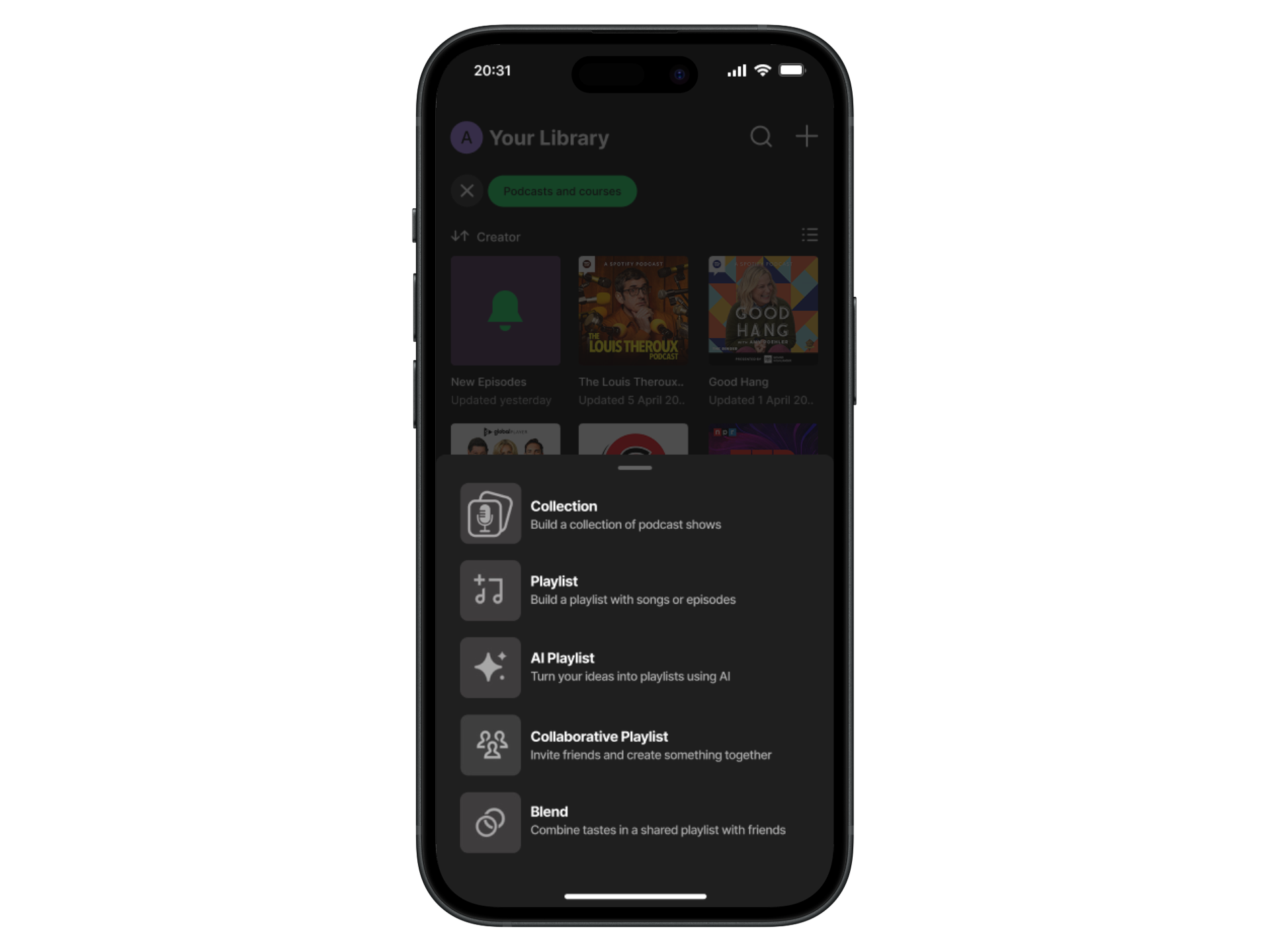
Task 3: Podcast Grouping - Create a new podcast collection.
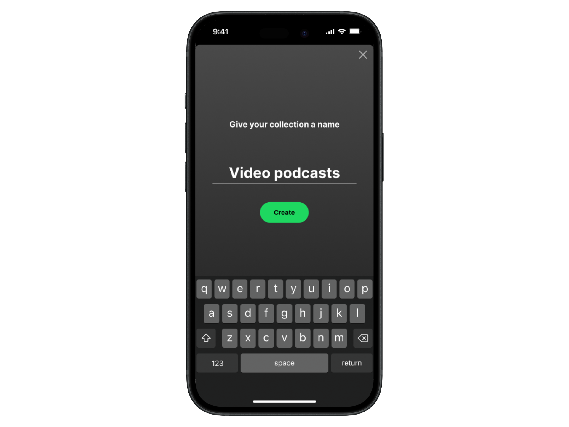
Task 4: From the podcast library, add a show to the newly created collection.
Lo-fi Wireframes
With a feature idea in mind, and an understanding of how it would fit in with the current information architecture of Spotify’s mobile app, I began sketching out the flows for each task, using pen and paper. This gave me time to consider the UI of the mobile app and how I would need to work within the constraints of their brand by using existing components.
Task 3 Sketches: Key screens, starting from podcast dashboard.
Task 4 Sketches: Key screens, starting from podcast library.
Deliver
Hi-fi Wireframes
Following on from lo-fi sketches and a round of mid-fi usability testing, I used feedback to begin creating hi-fi wireframes in Figma. Utilising Spotify UI kits, components and design guidelines helped to speed up my workflow and ensure my feature idea fitted in seamlessly with their current UI. During this phase, I also learnt more about Spotify’s design system; Encore, and how they went about refreshing their icons, back in 2022.
Task 3: Podcast grouping - create a new podcast collection.
Task 4: From the podcast library, add a show to the newly created collection.
Usability Testing
At this stage of adding a feature, I wanted to give the user an increased awareness of the podcasts they already follow, whilst also giving them the option to categorise their podcast library more to their own preferences.
I created a functional high-fidelity prototype which I took to usability tests to validate the design and identify any areas for improvement. I conducted eight moderated usability tests remotely via Zoom, sharing the Figma prototype with Spotify users.
With success metrics in place, (time on task, error rate, completion rate, and feedback) I asked each participant to complete the following tasks:
Task 1: Still interested in these podcasts - reminder.
Instruction: From this screen, show me how you would tell Spotify that you are no longer interested in following a podcast show called ‘Today Explained’.
Task 2: Podcast library highlight on dashboard.
Instruction: From this screen, show me how you would go to podcasts from your library.
Task 3: Podcast grouping - create a new collection.
Instruction: From this screen, show me how you would create a new podcast collection.
Task 4: Add a podcast show from your library, to the newly created collection.
Instruction: From this screen, show me how you would add a show called ‘The Louis Theroux Podcast’, to the collection called ‘video podcasts’.
Summary of Usability Test Findings:
All participants successfully completed each task with ease and minimal errors. Prompting by the moderator was mainly provided during task 1 - to click on the ‘go to podcasts’ button. Overall, participants said they liked the ‘forgotten podcasts reminder’ and ‘collections’ feature idea and would utilise it as part of their podcast experience.
A majority of participants said they didn’t usually read pop up messages and during task 1 they dismissed it, despite feedback from an earlier usability test indicating that a pop up message would be more effective than a top banner.
When adding to, or creating a collection, users might not always navigate to their library to do so. Instead, they’d click into the specific podcast show and add to, or create a collection from there.
In the podcast library view, participants would like a ‘drag & drop’ feature to become available on the mobile app, so they can easily add podcast shows to a collection.
Recommendations for improvement:
Task 1: Add a ‘toast’ component on the final screen, to reinforce the ‘not interested’ action.
Task 1: Make the pop up message more impactful with larger and more descriptive text.
Task 3 & 4 : Iterate on the newly created ‘collection’ icon to make it look more podcast specific.
Revisions
Task 1: Design Decision
Based on feedback from usability testing, I removed image of podcast show and replaced with personalised header text. I also amended sub header text for further clarification.
Task 2: Design Decision
Based on feedback from usability testing, I added a toast element to the final screen to reinforce the previous action of clicking on ‘not interested’.
Task 3 & 4: Design Decision
Based on feedback from usability testing, I made changes to the newly created ‘collections’ icon to make it look less generic and more podcast specific, by adding a mic.
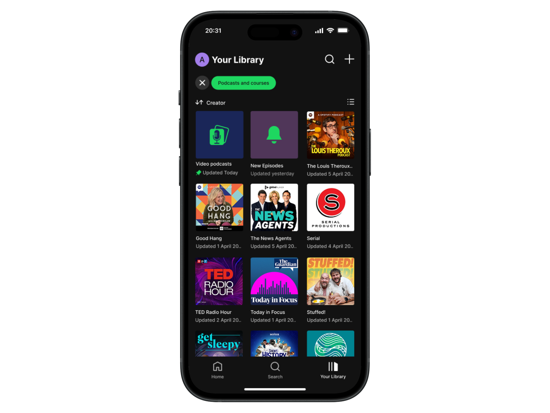
Final Product

Reflection
What was your main challenge in the project, and how have you handled it?
The main challenge in this project was working within the brand constraints of Spotify and ensuring my feature idea fitted in with the information architecture of their mobile app. Even as Spotify user myself, I had to familiarise myself with some of the existing feature layouts and user flows. I also did research around Spotify’s design guidelines to ensure that I was using the correct colours and styles throughout the wireframes.
Through my user interviews, an unexpected finding that I encountered was that interviewees had totally forgotten about podcasts they already follow and therefore have a lot of podcast content backed up in their Spotify library. I addressed this with my feature idea by trying to bring the content in their library to the forefront of their podcast experience. During my research phase, I learnt that Spotify leans heavily on recommending new podcast content, but doesn’t do enough to highlight the podcast content users already follow.
What are some lessons you’ve learnt through the project?
Get user feedback as early as possible within the design process and iterate to help refine solutions.
Understanding the level of impact that the introduction of a new feature can have on the user experience.
Spotify’s UI is constantly evolving: Especially during the timeframe of this project, I realised how the UI of their mobile app is always being iterated upon.
Has the project changed your outlook as a designer?
Yes, it has given me a perspective on what it would be like to work on an existing product, which is currently used on a daily basis, by millions of people.
What are your next steps for the project?
To a degree, this project validated my problem hypothesis as well as uncovering other unexpected findings about Spotify podcast listeners. With regards to podcasts specifically, the library feature of Spotify’s mobile app is underutilised by users and presents the opportunity to develop further customisation features, similar to their music services.