
Hobby Helper
A mobile-first website to assist with learning a new skill.
ROLE
Sole UX/UI Designer, UX Researcher
TOOLS
Figma, Miro, Optimal Workshop, Zoom
OVERVIEW
Hobby Helper, a mobile-first website, was created as a student project for Designlab UX Academy. I was responsible for the end-to-end design process; conducting user research and analysis, wireframes, prototypes and usability testing.
TIMELINE
Mar - Dec 2024: Part time schedule
GOAL
The main objective of the project was to create a MVP which could be utilised during the process of learning a new skill. I was addressing the need for a platform which offered 1-on-1 guidance.
PROBLEM
Learning a new skill is challenging when there’s a lack of feedback, especially when mistakes are being made and users don’t have the knowledge or tools to overcome them.
Learning a new skill on your own feels lonely and demotivating.

SOLUTION

Hobby Helper is an expert-led website which provides users with individualised feedback, allowing them to progress further with learning a new skill, whilst also encouraging social interaction.
PROCESS
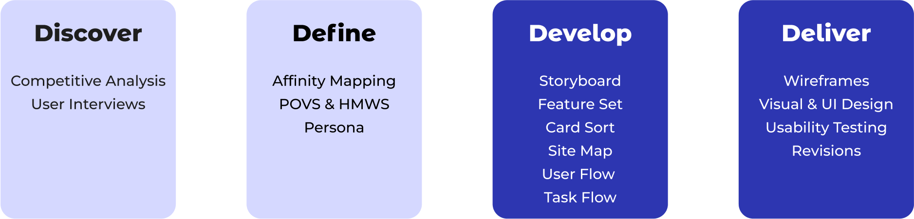
Discover
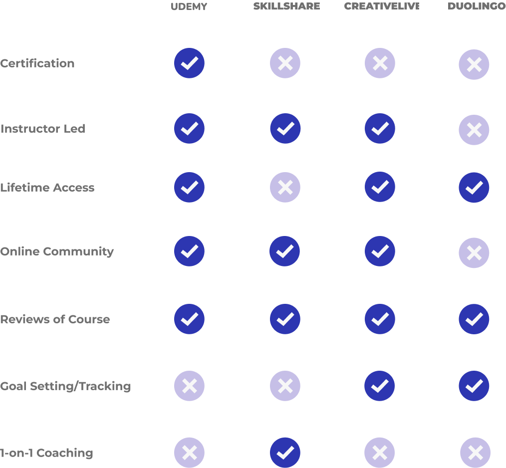
COMPETITIVE ANALYSIS
After carrying out initial desk research, I completed an analysis of two direct and two indirect competitors to understand strengths, weaknesses and opportunities.
Key Findings:
1. There is a lot of video content with instructors to lead but a lack of personalised, 1-on-1 coaching.
2. There are limited goal setting / progress tracking features available depending on which subscription or classes users choose.
3. Community support is a key feature and is met in different ways depending on the platform.
With this research, I tried to define how my product would fit into the market of learning platforms.
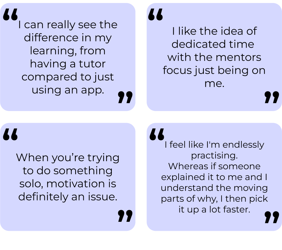
USER INTERVIEWS
I conducted user interviews to understand the attitudes and frustrations people have around learning new skills. I prepared an interview script with open-ended questions, focusing on motivations, experiences and pain points. I recruited and interviewed 9 participants remotely, after which I referred back to throughout the design process.

Key Findings:
Motivations: participants learn a new skill for enjoyment as a hobby, for career advancement or for personal growth.
Frustrations: Regardless of motivations, participants struggle with learning a new skill on their own, in a solitary environment with lack of personal feedback - if they make mistakes they don’t always know how to move forward.
Assumptions: The social aspect of learning is important to participants, and despite my initial assumptions, interviewees said the challenge of time and/ or money are overcome by choosing more affordable options and planning activities around their schedules.
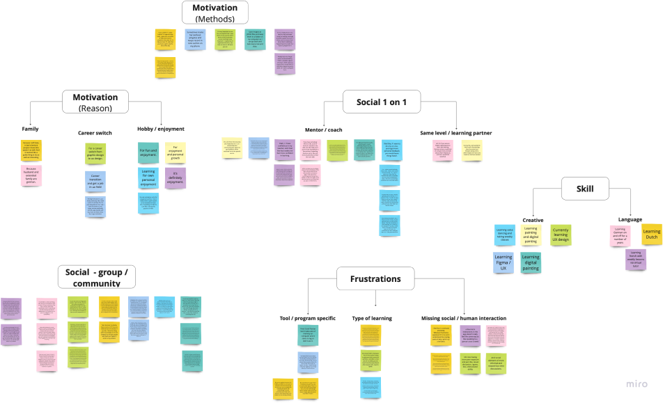
AFFINITY MAPPING
With the findings from my user interviews, I produced an affinity map to look for any patterns or themes which started to emerge. Based on the information gathered, I began grouping it into four categories:
Motivations
Frustrations
Learning style, frequency, level
Social interactions; community, 1-on-1.
After the interviews and affinity mapping, I noticed that a majority of participants I’d spoken with had decided to learn a new skill for enjoyment, as a hobby. Therefore, I decided that this would be the area of focus for the project.
Define
Affinity Map - Miro
POVS & HMWS
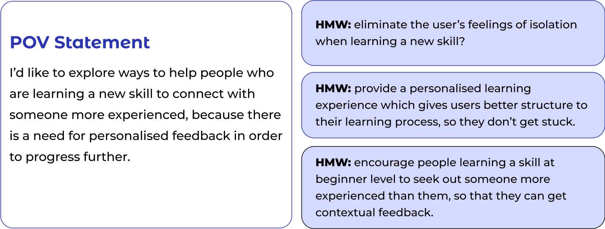
I generated point of view statements and how might we questions to narrow the focus of the problem I’m trying to solve, define the user and their needs. This stage took a couple of iterations; as my original POV statement was too specific, and needed to be written in broader terms. In my statement I followed the pattern: 1) a user, 2) a need, and 3) a goal.
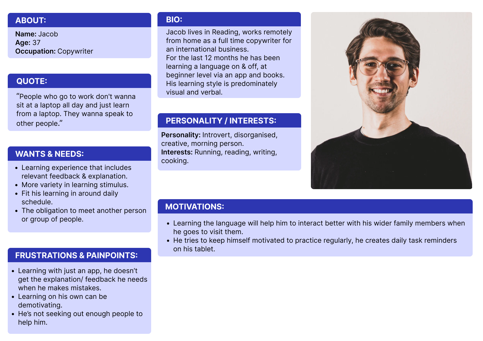
PERSONA
By creating a persona I was able to empathise with the end user and understand key needs, frustrations, motivations. I came back to the persona throughout the entire design process to make sure that I didn’t lose sight of the primary user goals.
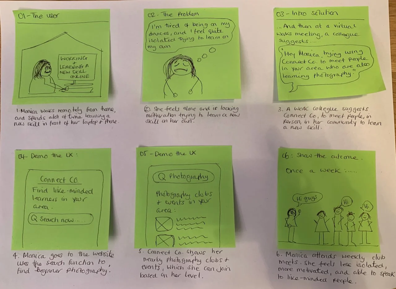
STORYBOARD
With the persona in mind, I drew two storyboards to paint the picture of the problem space and to begin visualising potential solutions. This part of the process gave me a high-level view of the problem space, introducing the solution, demonstrating the UX and showing the outcome.
Develop
Idea 2: Peer community
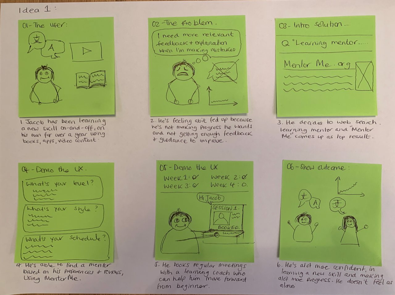
Idea 1: Mentor
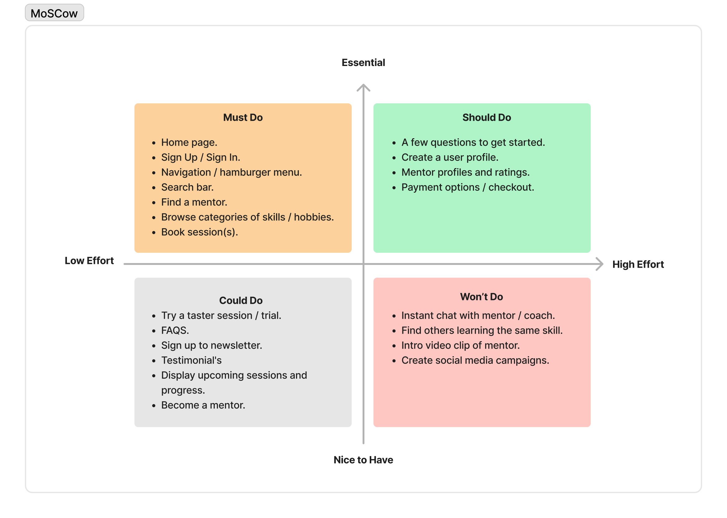
FEATURE SET
Once I had an idea to focus on, I brought together my user research, persona and business needs and began prioritisation using the MoSCoW method to map out key features for the product.
As I was creating a MVP, I mainly concentrated on the ‘must do’ and ‘should do’ features.
CARD SORT + SITEMAP
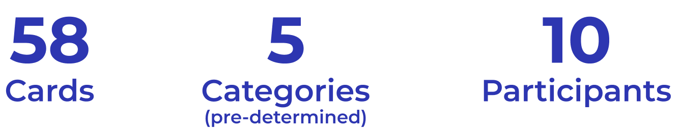
To make sure that the site’s information architecture is aligned with user expectations, I used Optimal Workshop for a unmoderated & remote hybrid card sort in order to understand the mental models of how users categorise information of given topics such as; learn, about, mentor, profile. I analysed the results with a similarity matrix, which allowed me to identify strong card pairings and potential groupings.
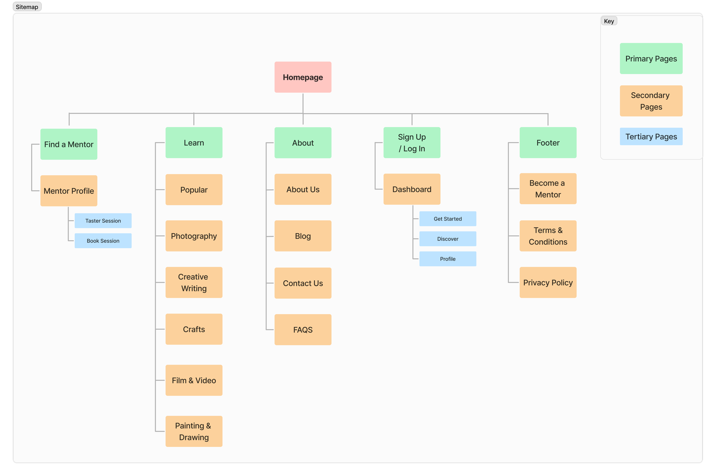
Once this had been completed, I produced a sitemap to show the structure and how pages will be organised, which also began to give me ideas about how it might be navigated by the user.
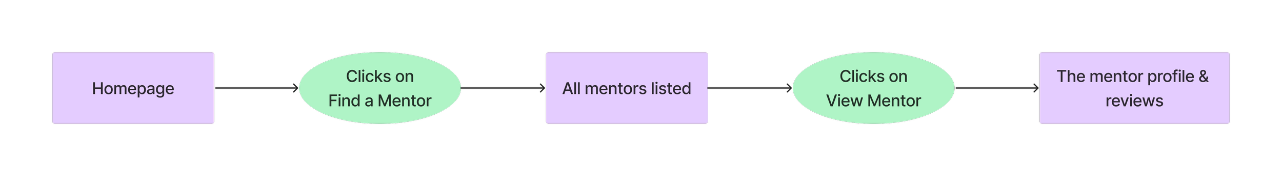
USER FLOW & TASK FLOW
With the persona, ‘must do’ and ‘should do’ features in mind, I produced user flows and task flows to understand the key interactions a user will make in order to achieve their end goal, following either a happy or unhappy path. This took a few iterations to properly understand the differences between the types of flow, including the key elements required for each.
User Flow: Finding a mentor and booking a session
Task Flow: Finding a mentor via website navigation
SKETCHES
Deliver
Low-fidelity sketches on paper allowed me to brainstorm ideas, start to visualise concepts and consider the layout and content of the product. My initial sketches were based on the information I had gathered from my user research, feature set, user and task flows. Initially putting pen to paper was challenging, but once I made a start, the exploration of ideas easily began to flow.
Homepage
Mentors listed
Mentor profile
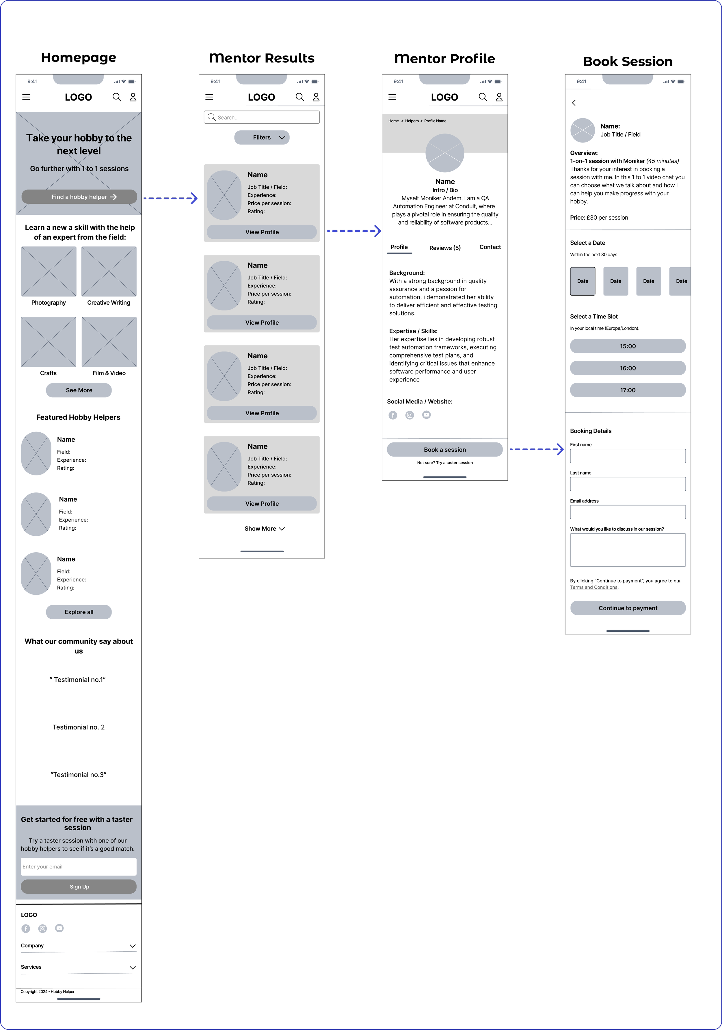
MID-FI WIREFRAMES
Using Figma, I translated my sketches into mid-fidelity wireframes for a responsive website. This also gave me the opportunity to learn and understand the mobile-first and content-first approach to creating products. By researching the content and design patterns that other websites had used, I has able to pinpoint the essential content I wanted to include for my product.
VISUAL & UI DESIGN
Whilst developing my wireframes, I began to build the visual design elements and UI component library, which would contribute towards the overall design system. I used the storyboards and persona to guide my thoughts around the brand name, logo and values.
When it came to creating the brand colour palette and UI components; I wanted to be sure that the colours I selected were accessible and achieved at least a WCAG AA level; with a contrast ratio of 4.5:1.
HI-FI WIREFRAMES
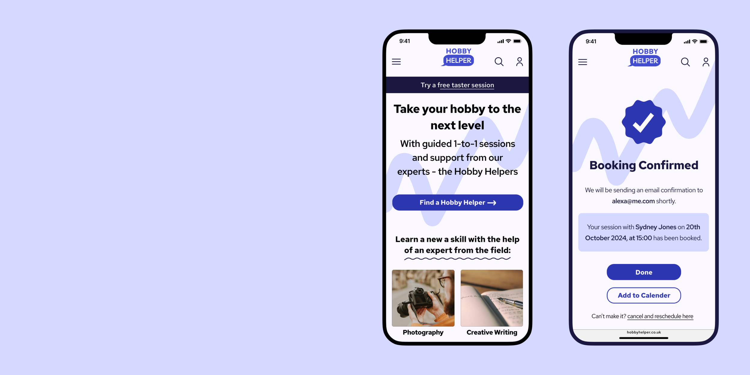
I used Figma to combine the visual and UI design elements with my wireframes which resulted in high fidelity wireframes, from which I could proceed with a prototype to take to usability testing.
Key screens: booking a session
USABILITY TESTING & REVISIONS
I created a functional high-fidelity prototype which I took to usability tests to validate the design and identify any areas for improvement. I conducted 8 usability tests remotely via Zoom, whilst sharing my Figma prototype. Each participant completed two specific tasks: 1) Finding a Hobby Helper profile and reading reviews 2) Booking a session with a photography helper with follow up questions around the overall look and feel of the product. The test results indicated that the website met with user expectations and was easy to use.
Recommendations for improvement included:
Add examples of the experts' work on their profile page.
Add star rating system to profile page including in the reviews section.
Change the ‘book a session’ button to fixed position.
Hobby Helper Profile Page Revisions:
Add star rating and number of reviews at the top of the page.
Change the UI of the sub-menu to look more clickable.
Homepage Revisions:
Added top banner for taster sessions.
Make logo element look more like a speech bubble.
Added text to better explain the product.
Hobby Helper Profile Page Revisions: continued
Added examples of the experts work and/or links to their website.
Fixed ‘book a session’ button.
Made ‘try a taster session’ into a secondary button.
FINAL PRODUCT
REFLECTION + NEXT STEPS
What was your main challenge in the project, and how have you handled it?
One of the main challenges was trying to scope the research to understand the problem space around the topic of ‘learning a new skill’. I managed to overcome this by creating a research plan and an interview guide, which helped me to consider and define my direction of questioning. A second challenge has been working as a ‘team of one’ throughout this project; having peer support and mentor guidance has allowed me to regularly voice my design decisions, and seek feedback.
What are some lessons you’ve learnt through this project?
Assumptions were challenged - from my user research, time & money weren’t considered to be a barrier to learning a new skill, as I initially thought.
Social interaction and community are key aspects of people's learning experiences.
People highly value getting advice and support from the experts in their field.
Has the project changed your outlook as a designer?
Working on this project as the sole designer and researcher has given me an insight into the role of a UX generalist as well as beginning to understand that a designer's job is about bringing value to both the users and the business.
Next steps include:
Continuing to iterate and test designs, to ensure the product meets user needs and expectations.
Working with a development team to build the minimum viable product.
Develop desirable features such as instant chats and introductory video clips.